Principal
Components Analysis
Suppose you have samples located in environmental space or in species space (See Similarity, Difference and Distance). If you could simultaneously envision all environmental variables or all species, then there would be little need for ordination methods. However, with more than three dimensions, we usually need a little help. What PCA does is that it takes your cloud of data points, and rotates it such that the maximum variability is visible. Another way of saying this is that it identifies your most important gradients.
Let us take a hypothetical example where you have measured three different species, X1, X2, and X3:
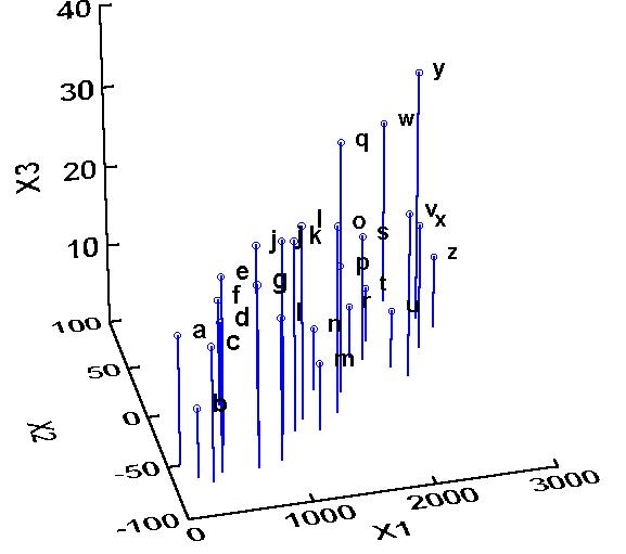
In this example, it is possible (though it might be difficult) to tell that X1 and X2 are related to each other, and it is less clear whether X3 is related to either X1 or X2. Our job is to determine whether there is/are a hidden factor(s) or component(s) (or in the case of community ecology, gradient(s) ) along which our samples vary with respect to species composition.
(Note that X2 has negative values, something that will not happen with real species. I am only including such a variable to demonstrate that the initial scaling is not relevant in PCA).
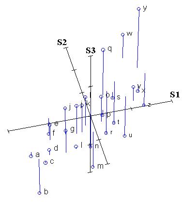
The first stage in rotating the data cloud is to standardize the data by subtracting the mean and dividing by the standard deviation. Thus, the centroid of the whole data set is zero. We label these standardized axes S1, S2, and S3. The relative location of points remains the same:
- A footnote: it may be argued that we should not divide
by the standard deviation - we would want a species which varies from,
say, 8 to 10000 individuals to be considered more variable than a species
which varies from 100 to 102 individuals. By standardizing, we are giving
all species the same variation, i.e. a standard deviation of 1. We
actually can have it both ways: a PCA without dividing by the standard
deviation is an eigenanalysis
of the covariance matrix, and a PCA in which you do indeed divide by the
standard deviation is an eigenanalysis of the correlation matrix. (to
do the latter in CANOCO, you need to specify "center and
standardize" your species - recall that the covariance of
standardized variables equals the correlation!). When using
species/variables measured in different units, you must use a
correlation matrix.
From looking at the last two figures, one can already identify a gradient: from the lower left front to the upper right back. In other words, there appears to be an underlying gradient along which species 1 and species 2 both increase (In the language of Gauch (1982), species 1 and 2 both contain some "redundant" information. Let us now draw a line along this gradient:
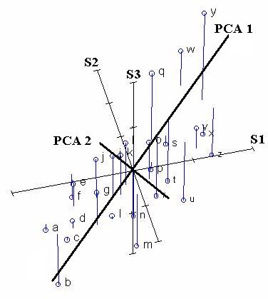
Principal Components Analysis chooses the first PCA axis as that line that goes through the centroid, but also minimizes the square of the distance of each point to that line. Thus, in some sense, the line is as close to all of the data as possible. Equivalently, the line goes through the maximum variation in the data.
The second PCA axis also must go through the centroid, and also goes through the maximum variation in the data, but with a certain constraint: It must be completely uncorrelated (i.e. at right angles, or "orthogonal") to PCA axis 1.
If we rotate the coordinate frame of PCA Axis 1 to be on the X-axis, and PCA Axis 2 to be on the Y-axis, then we get the following diagram:
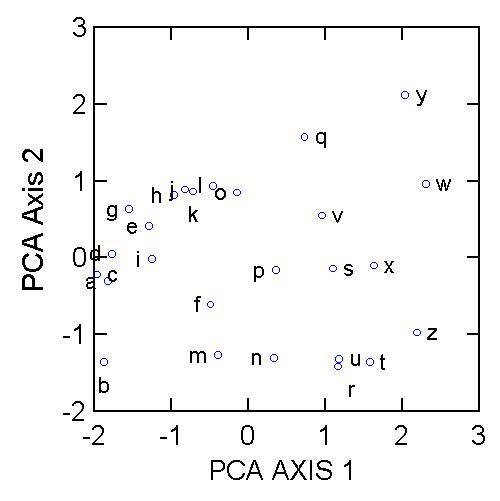
We can see that samples a, b, c, and d are at one extreme of species composition, and samples t, w, x, y, and z are at the other extreme. But there is a secondary gradient of species composition, from samples b, m, n, u, r and t up to samples l, q, w, and y. What is the underlying biology behind such a gradient? PCA, and any other indirect gradient analysis, is silent with respect to this question. This is where the biological interpretation comes in. The scientist needs to ask, what is special about the samples on the right which make them fundamentally different from those samples on the left? What is it about the biology of species 1 that makes it occur in the same locations as species 2?
We have only plotted two PCA Axes. However, there exist three axes in the data set (because there are three species). Why did we not plot the third? This is for two reasons:
- If we were going to plot three axes, then why even
bother to perform PCA in the first place? We end up with just as
complicated a diagram as we start out with (i.e. samples in 3-dimensional
species space.
- The third axis is much, much less important than the
first two, as described below.
How do we determine how many axes are worth interpreting? Ultimately, this is left up to the reasons for the investigation. But a big hint can be found with the eigenvalues. Every axis has an eigenvalue (also called latent root) associated with it, and they are ranked from the highest to the lowest. The first through the third eigenvalues for the first three axes in the above example are 1.8907, 0.9951, and 0.1142 respectively. These are related to the amount of variation explained by the axis. Note that the sum of the eigenvalues is 3, which is also the number of variables. It is usually typical to express the eigenvalues as a percentage of the total:
PCA Axis 1: 63%
PCA Axis 2: 33%
PCA Axis 3: 4%
In other words, our first axis explained or "extracted" almost 2/3 of the variation in the entire data set, and the second axis explained almost all of the remaining variation. Axis 3 only explained a trivial amount, and might not be worth interpreting.
How do we know which species contribute to which axes? We look at the component loadings (or "factor loadings"):
|
Species |
PCA 1 |
PCA 2 |
PCA 3 |
|
S1 |
0.9688 |
0.0664 |
-0.2387 |
|
S2 |
0.9701 |
0.0408 |
0.2391 |
|
S3 |
-0.1045 |
0.9945 |
0.0061 |
This means that the value of a sample along the first axis of PCA is 0.9688 times the standardized abundance of species 1 PLUS 0.9701 times the standardized abundance of species 2 PLUS -0.1045 times the standardized abundance of species 3.
We can interpret Axis 1 as being highly positively related to the abundances of species 1 and 2, and weekly negatively related to the abundance of species 3. Axis 2, on the other hand, is positively related to (and therefore correlated with) the abundance of all species, but mostly species 3. So the "gradient" reflected by Axis 2 is something which benefits species 3.
PCA is extremely useful when we expect species to be linearly (or even monotonically) related to each other. Unfortunately, we rarely encounter such a situation in nature. It is much more likely that species have a unimodal species response curve. That is, species usually peak in abundance at some intermediate part of environmental gradients (see also Explorations in Coenospace). Here is a hypothetical coenocline:
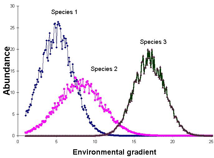
This means that species are non linearly related to each other. Let us now plot the abundance of the above three hypothetical species in species space:
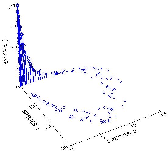
However you describe the above cloud of points, it is certainly not a simple line or a plane. PCA would fail miserably with such a data set. In particular, PCA produces an artifact known as the Horseshoe Effect (similar to the Arch Effect), in which the second axis is curved and twisted relative to the first, and does not represent a true secondary gradient. Do note, however, that if we only sampled a small enough section of the gradient the data might be linear enough to allow the use of PCA.
For the Boomer Lake example given in Explorations in Coenospace, we have belt transects established along a lake shore, and a fairly well-defined zonation of plant species occurs as a function of distance from the water. When we perform a PCA on this data set, we get the following diagram:
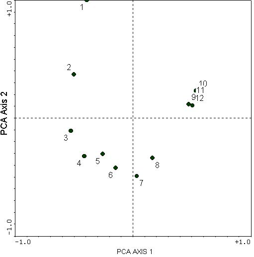
This illustrates the horseshoe effect. The second axis is a curved distortion of the first axis. The second axis also has no easily understood biological meaning: there is no obvious reasons why samples 6, 7, and 8 should be at opposite ends of a gradient from samples 1, 2, and 9 through 12.
However, do recall that there was one predominant gradient: that of sample 1 through 12 (being a wetland to dryland gradient). However, PCA distorts this relationship with some incurving. Instead of going from sample 1 to 12 (as it should), the most extreme samples along PCA Axis 1 are samples 3 and 10.
The "toe" of the horseshoe can either be up or down; in this case it just happens to be down.
In this particular example, we are able to see the arch, and therefore might be able to conclude that the "real" extremes are quadrats 1 and 10,11, or 12. This is because there is only one clear gradient and the gradient is so strong. However, in many data sets, there may be more and weaker gradients, as well as more noise. Therefore, it would be very difficult to make sense of PCA.
Although PCA is seldom useful for the analysis of samples in species space, it is still quite appropriate for the analysis of samples in environmental space. This is because it is likely for most environmental variables to be monotonically related to underlying factors, and to each other. Also, PCA allows the use of variables which are not measured in the same units (e.g. elevation, concentration of nutrients, temperature, pH, etc.).
This page was created and is maintained by Michael
Palmer.
